Actionable design strategies, print finish breakdowns, and brand-building wisdom from industry experts.
Paper Weight & Finish Guide
Understand the tangible difference between 14pt standard, 16pt premium matte, and 32pt ultra-thick luxury stocks.
Designing with Print Bleed
Avoid unwanted white borders by extending background artwork 0.125 inches beyond the trim line.
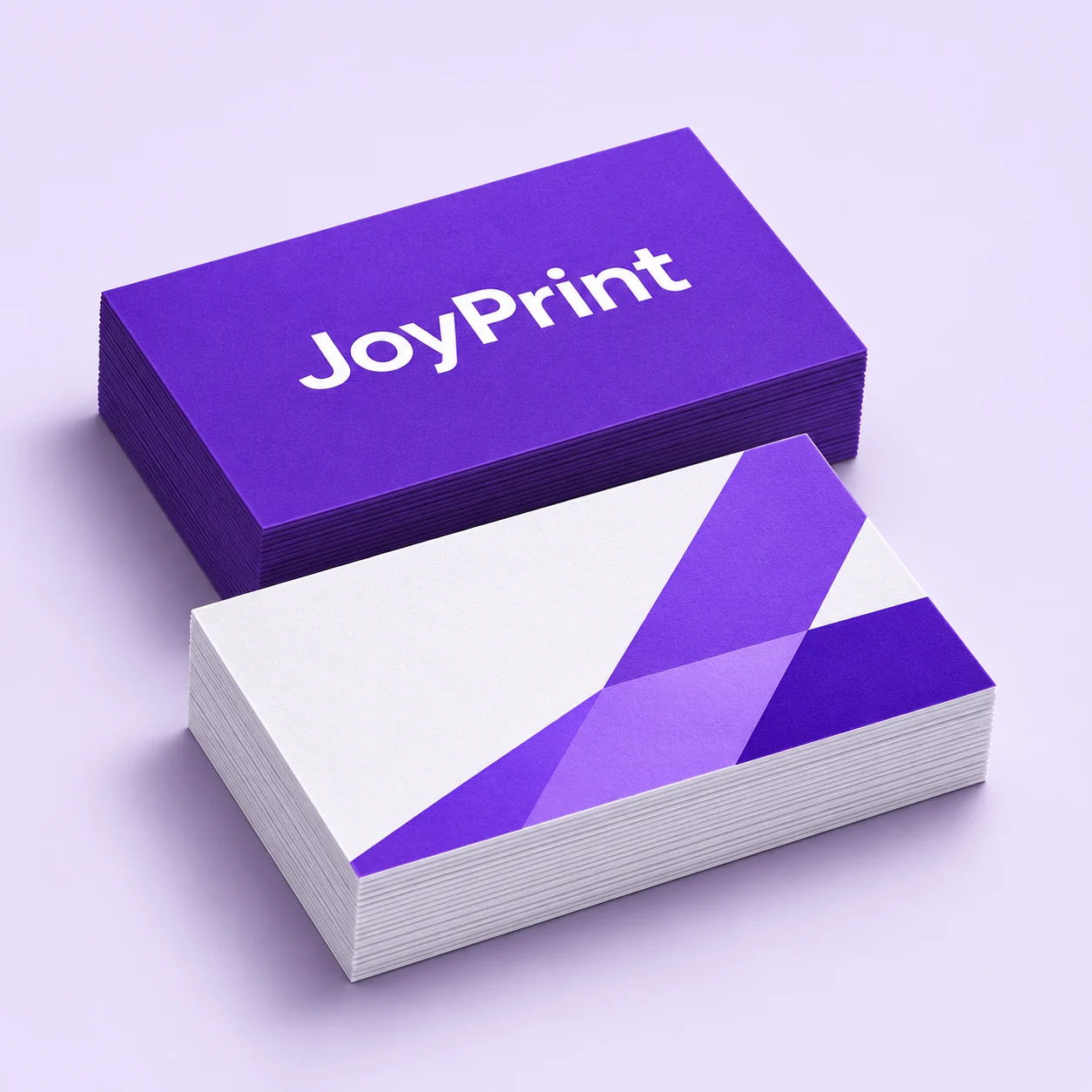
3 Rules for High-Converting Business Cards
- Maintain Contrast: Always keep text contrast above 4.5:1 against card backgrounds for effortless readability in all lighting conditions.
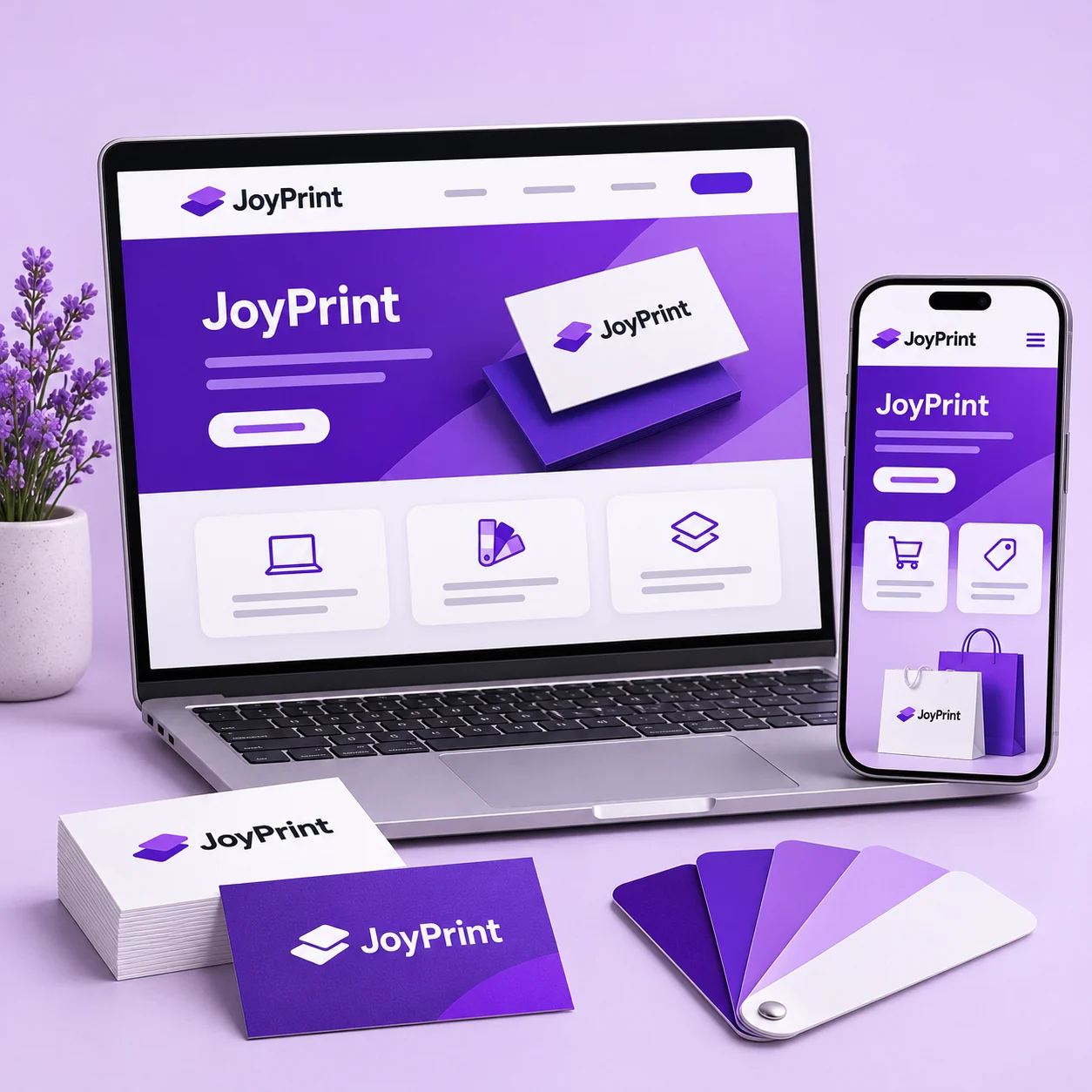
- Focal Hierarchy: Your company name or mark should command the visual entry point, followed by your name, contact phone, and digital presence.
- Incorporate Tactile Finishes: Spot UV or metallic foil highlights on your logo elevate perceived brand authority by 67% according to neuromarketing studies.